|
Out of all of my prints, I think my screenprint was the most successful. Overall, I think it had the least mistakes, except for the circle surrounding the lambda which was a big issue. Though I feel the colors mixed nicely, but in one area there is a bit too much red. As well as the design is from one of my favorite games of all time.
My print I would want to change most is my monoprint. First off, it's not even a landscape, just a stick figure with a "pumpkin head". Regarding that, I would also try to make it look nicer by not doing something so basic. When I was making it, I wanted to make just a pumpkin since i was trying to orange and blue but they accidentally mixed. As well as, it would never take up a good amount of space, so I said screw it and just made a stick figure pumpkin head man, putting in little effort, which I wish I put more in. I enjoyed working with soft kut the most. It was easy to transfer a design since all you had to do was trace the design, which was easy in of itself. I also just liked how smooth the cutting was and how the gouge just glides so smoothly across it. Though sometimes if was hard to get enough paint on and then I would end up putting on too much paint. Cleanup was especially easy as well, all you had to do is wash it under the sink. In this piece I did not play around too much. I learned how the cover of cardboard is very easy to tear. I learned how cardboard reacts to tempera, in that you definitely need an extra layer and sometimes markings on the box show through. For example in the second hill there is some areas where it is lighter than the rest. When I was cutting out the actual figures for the piece, I always made sure they would make the right shape and tried to make the original pieces I cut them out from as equal sized as possible. I also was reminded of how tempera dries a shade or two darker than the original, which is why the third hill is basically black. Another new technique I acquired was how to cut cardboard, in which I learned the proper way to cut and that I need to go through the cuts multiple times for it to be a full cut and how the knife sometimes trails off.
Earth art is any art that does not use any artificial materials in the process of creation of the piece. With this project I learned the properties of and how to work with natural materials, namely sticks. I also kept myself engaged in the creation of this project, by going mostly every day to work on it. I persisted through all the difficulties of working with natural materials, i.e getting good structural materials, finding a good place, etc. . I also found a way to link this to myself. I am a boy scout so knowing how to make certain structures with just natural materials might help in a competition during a camp out. I am also a big fan of mythology and the way it's made, it reminds me of Lilliputians from Gulliver's Travels and how they made smaller scale replicas of our everyday items.
In this piece I become familiar with the delicate nature of styrofoam. As well as how easy it is for scissors mess up cups since it is hard for the scissors to go through. I also solved some problems. For example the ring at the top was actually broken because I pulled on it too much so I just taped it together. Also the top cup could not support itself so I got an extra cup to hold it up. I also explored with this new material, for example I had tried to go for the styrogami structure with multiple similar shapes. I also tried to use positive and negative space by having overlapping shapes to make the positive and negative space but it kind of flopped.
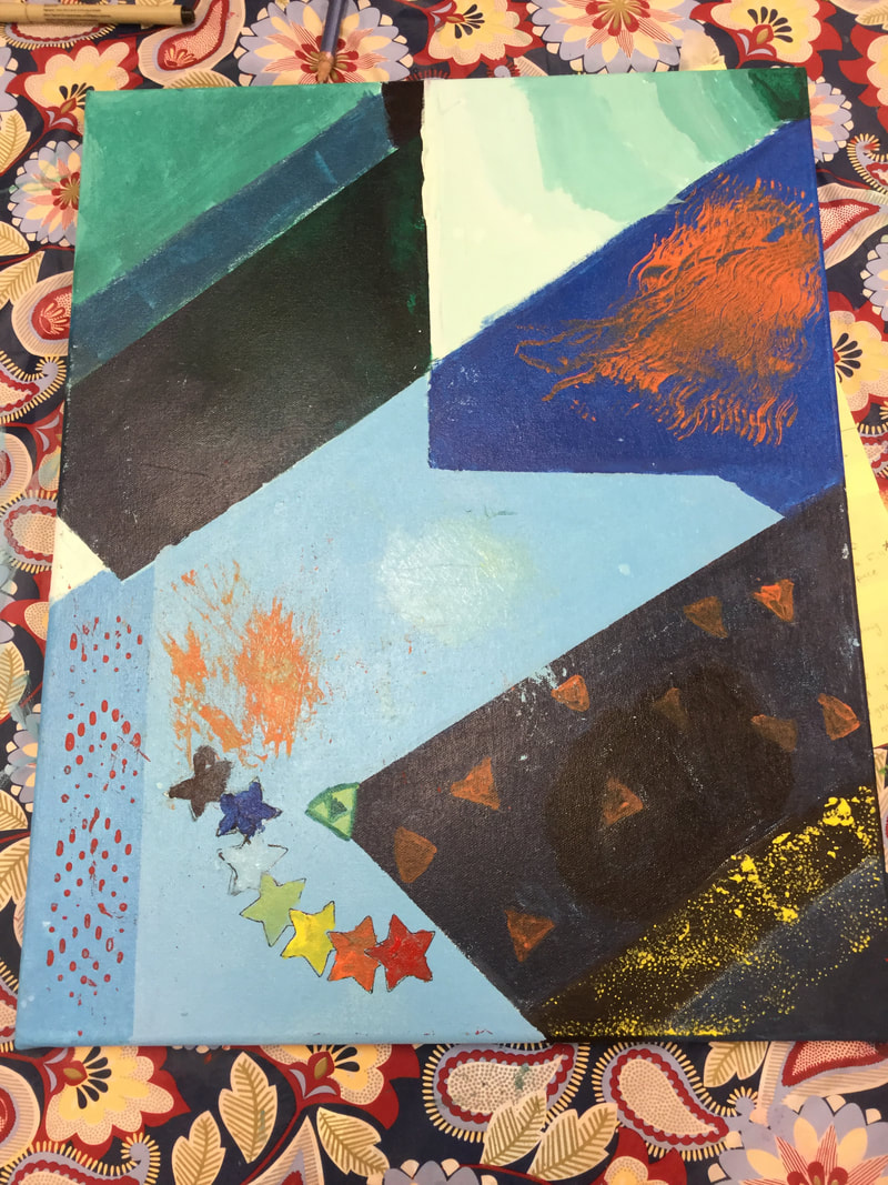 The thing that inspired me throughout this entire work was how free we were. We could do anything, lines, add texture, patterns, etc.. Also the medium seemed to be similar to tempera, which I prefer over to most mediums. When we were developing the piece, we first copied the part of one of our previous abstract pieces. Secondly we planned out what values correspond to the image. We then used color swathes that were close to the planned values with a color scheme of shades of blue/green. We did also tried to make the colors as close as possible for the first half of the piece. One thing I think we should have done is to not try to get the colors to an exact tee, as with what happened last time, we wasted a little time trying to achieve this. Also I think we should've used tape to make straighter shapes while painting. As well as the tools we used to make patterns were a bit too random for my taste. Due to this piece being a group effort, we had collaborated/worked together throughout the entire project. For example you see me holding the ruler while Jaun traces over the pencil lines with sharpie. I also developed some experience with acrylic and now am aware of how it dries a shade or 2 darker and how easy it is to paint over mistakes. Like how when I was painting the dark area in the right corner there is a space on the left side a bit darker than the background, we had to paint over it once or twice to make it straight using tape. As mentioned a problem I solved is to use tape along the edge it is against to make it straighter. The black line in the bottom right was also fixed using this method.
How my composition improved:
Architecture: My composition that showed architecture improved because on the 2nd piece there was less clutter that wasn't related to the focus of the piece, but it's also not taking up the entire piece as well. The odd perspective on the 1st piece was also fixed in the 2nd piece. Landscape: My composition that showed a landscape improved because the horizon is easier to tell as well as it is higher up, improving the sense of depth. The 2nd piece also had more variety in what covered the landscape. Motion: My composition that showed something in motion improved because it showed the destination of the water. Though the original did have a better sense of motion, there was more focus on the water in the 2nd with less clutter. Portrait: My composition that showed a portrait of someone improved because there was less background clutter. As well as the colors of the background and foreground are complementary, drawing the viewers attention to the person in the portrait. Still Life: My composition that showed a still life image of 3 objects improved because there was not as many extra objects around, helping put focus on the main subject, it is also not in the center of the piece.6h6t4we 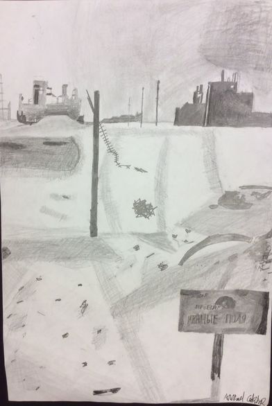 The title for my artwork is последствия, which is Russian for aftermath. The subject of my artwork is to make a barren wasteland landscape. Two elements that are noticeable is the crosshatching in the slopes and some areas of the hills, and the blending in the sky. The medium I used in this artwork was graphite. I used crosshatching and blending, as mentioned before. I also used vanishing point as well. I blended using either a shading stump or my pointer/middle finger. The inspiration for my artwork was a photograph taken after the invasion of Stalingrad. I tried to show my interest for the world wars era. My goal as an artist is to be not Michelangelo good, but at least being able to draw a person decently. Though that new goal I set was not accomplished. Lines are still a bit too scraggly and the top right of the sky is a bit too boxy. Though I say this piece was passable, as mentioned before, the lines are too scraggly, the top right is not blended very well, as well as the hills being kind of difficult to make out and the slope near the building on the left looks more like an amoeba than a hill. I learned about vanishing point and how to make slopes look like slopes. This piece did a bit of what I wanted. I wanted to use elements from the photograph and make them look pretty close, but with my level of skill it looks more like a loose portrayal. This piece will influence me to be less scraggly with my lines and make sure everything can blend well.
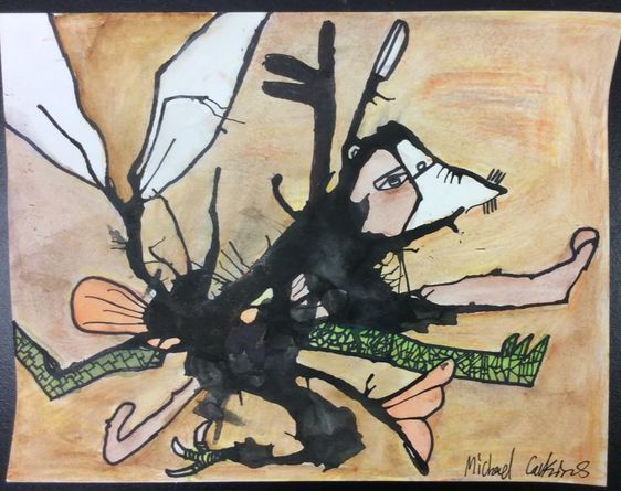 The title of my artwork is “Victor”. To me my artwork seems to resemble Frankenstein’s monster. Though with animal parts instead of human parts. I used an ink splat to make the “Monster”, then I used watercolor pencils and a brush with water on it to color in the body parts. I was inspired by the Montauk Monster. I had originally thought the Montauk Monster was an amalgamation of different animals but I was quite off. My goal was to be a decent artist in my last “piece”, and I think this helped me take at least one setup to becoming a better artist. In that it taught me to be more creative when making an art piece. One of my new goals however, is to be neater when trying to color things, since sometimes the watercolor ran into parts I did not want it too, and I kind of wore down the paper too much. The piece overall is kind of what I imagined. It did what wanted it to do, be a weird amalgamation of a bunch of animals. Though I wish there was more variety in the animal parts and I wish I did a better job on the eyes. I also believe the wings could look less bug like. It will influence me to be more careful when using water and to try and keep things from running into places I don’t want them to.
|
AuthorMichael Calkins Archives
December 2017
Categories |
 RSS Feed
Photo used under Creative Commons from iainmerchant
